
Learn a repeatable, product-first workflow to turn items into publish-ready visuals fast. This introduction shows what you will learn: how to create clothing store Instagram assets using a single creative platform with built-in AI tools.
Expect a clear, step-by-step guide that works for boutiques, streetwear labels, and multi-location retail businesses across the United States. You will move from item concept to final file, with attention to brand, message, and CTA.
The guide explains why Canva’s AI features speed production without advanced design skills. It also previews stages: planning assets, setting up the platform, using templates, generating AI designs, polishing photos, converting to video, and publishing.
Practical checks for readability, mobile viewing, and color quality are included so posts look crisp on the feed. The simple success metric: faster creation time, consistent visuals, and stronger engagement signals like saves and clicks.
Key Takeaways
- Follow a product-first approach: item → brand → message → CTA.
- Use templates and AI tools to cut creation time.
- Check mobile preview and color accuracy before publishing.
- Apply a weekly system for drops, promos, and restocks.
- Measure success by creation speed, visual consistency, and engagement.
What Makes a Clothing Store Instagram Post “Scroll-Stopping” on a Social Media Platform
A scroll-stopping design must show the product clearly and give a single, easy reason to tap.
On a social media platform, that means a strong first-second impact: bold composition, an obvious product focus, and a clear action cue.
Product-first visuals that match your brand and community
Use clean hero shots, close fabric crops, and one lifestyle image to tell the item’s story. Keep compositions simple so the product reads instantly.
Match styling, models, and color palettes to your brand and community. This alignment builds trust and improves conversion.
Clear text hierarchy for promos, drops, and restocks
Headline: one bold line — “Limited run” or “Back in stock.”
Support: one brief line with what and when.
CTA: one short action — “Shop now,” “Tap link,” or “Save for later.”
Consistency across posts, videos, and stories for a cohesive feed
Apply recurring elements like borders, label tags, and price chips so the grid feels unified. Use the same type scale and color chips across formats.
- Effective hooks: “Limited run,” “Back in stock,” “New colorway,” “2-day sale,” “Last sizes” — each suits different urgency and inventory goals.
- Common mistakes: cluttered layouts, too many fonts, unclear pricing, and low-contrast text on busy backgrounds reduce performance.
“Great creative starts with preparation — not a last-minute edit in the editor.”
Next: Prepare your assets and launch details before you open the editor to speed design and keep results consistent.
Prep Your Content Before You Open Canva
Start by collecting the right visuals and goals so your workflow stays simple and repeatable.
Gathering assets first lets your team design faster and keep creative decisions focused on performance.
Collect product photos, logo files, and launch details
Make a short pre-design checklist: hero photo, detail photos, a lifestyle image, sizing notes, price, SKU, drop date/time, and shipping highlights.
For logo files, prefer a transparent PNG or SVG. Keep light and dark versions ready for different backgrounds.
Decide your goal: sales, traffic, or engagement
Sales-focused designs put price and urgency front and center.
Traffic-focused designs push “link in bio” and product benefits.
Engagement-focused creative invites saves, comments, or polls.
- Select a hero image with a clean background, strong lighting, accurate color, and room for text.
- Use a simple naming system for photos so teams and business partners find the right file fast.
- Set a measurable objective per item—drive profile visits, generate DMs, or increase saves—to guide design choices.
“Prepared assets and a clear goal cut time spent searching, resizing, and rewriting once you start the editor.”
End with a quick asset check so your content is ready for the designer or the next stage of your media workflow.
Set Up Canva for Faster Design Work Using Canva on Desktop or the App
Set up your workspace so designing becomes a fast, repeatable part of every product launch. A tidy setup saves time and reduces mistakes when you need to create designs quickly across devices.
Create designs with the right size and layout
Use a square 1080 x 1080 px canvas for grid feeds and a 1080 x 1350 px portrait for mobile-first scrolling. Portrait gives more screen space, but keep safe margins so UI overlays don’t hide text.
Organize uploads, photos, and images for quick reuse
Make folders for product lines, seasons, and campaigns. Store hero photos, detail images, and logos in each folder so the team can reuse media without re-importing.
Use cloud storage and collaboration for team workflows
Take advantage of the platform’s 5GB cloud and real-time collaboration. One person uploads assets, another assembles layouts in the editor, and a manager reviews before publishing.
- Use shared folders, comments, and version history to avoid lost edits.
- In a browser keep one tab for assets, one for the current design, and one for a reference board to cut context switching.
- Plan final checks on a phone so the design reads well in a smaller window.
“Good setup is the foundation — Brand Kit or Brand Hub then makes every new design faster and more uniform.”
Build a Consistent Look with Brand Kit and Brand Hub
A compact brand system keeps styles consistent so shoppers recognize your content in a single glance.
Why brand consistency matters: repeated visual cues help customers spot your products while scrolling. A single logo treatment, color set, and font pairing builds trust and speeds recognition.

Add your logo, brand colors, and fonts
Upload a primary logo, a secondary mark, and any icons. Define color swatches with HEX codes and lock them in the brand kit so every design uses the same palette.
Choose fonts with purpose: one display font for headlines and one clear font for pricing, dates, and URLs. Limit fonts to two or three for clarity.
Create reusable design elements for product lines and seasons
Build a small library of elements: size badges, “New Arrival” tags, sale stamps, price callouts, and fabric icons. Drag these into new designs to stay fast and consistent.
Guardrails: keep spacing steady, use brand colors as accents, and avoid clutter by limiting overlays per layout.
| Asset | Purpose | Best Practice | Example |
|---|---|---|---|
| Logo | Brand ID | Upload PNG/SVG, keep light/dark versions | Primary + mark |
| Colors | Visual unity | Set HEX codes, use accents sparingly | Primary, Accent, Neutral |
| Fonts | Readability & tone | One display + one readable body font | Headline + Price font |
| Elements | Repeatable cues | Create size badges, tags, and CTA buttons | New Arrival, Limited Drop |
“Once the brand system is set, templates become faster, safer, and easier to scale across collections.”
Choose the Right Instagram Templates for Clothing Brands
Start with templates when speed and repeatability matter, and build custom layouts only for standout launches.
When to use a template versus build from scratch
Use a template when you need fast, consistent content for weekly drops and restocks.
Start from scratch when a campaign needs a unique concept, unusual layout, or strict brand rules.
Template types that convert
New arrivals — single hero image with price and a bold CTA.
Lookbooks — multi-image grids that tell a styling story.
Sale graphics — high contrast layouts with a clear discount chip.
Keep templates flexible across categories
- Swap crops for tops, denim, footwear, and accessories.
- Change background treatments and texture overlays to avoid a generic feed.
- Reserve fixed areas for headline, price, and CTA so designs scale.
| Objective | Template Type | Key Feature |
|---|---|---|
| Awareness | Editorial lookbook | Multi-image grid, lifestyle focus |
| Conversion | New arrival template | Hero + price + CTA |
| Engagement | Interactive graphic | Question prompt, poll area |
“Repeatable templates make weekly content faster while keeping the feed cohesive.”
Tip: Use the design tool to generate multiple template options from one image and pick the strongest layout quickly.
Create a Canva AI Instagram post with Magic Design
Place your hero image into the design flow and immediately compare several visual directions for the campaign.
Quick walkthrough:
- Upload a clean product image and pick the Instagram format.
- Review multiple auto-generated designs and note the strongest layouts.
What to evaluate in generated options
Look for readability, clear product prominence, and space for price or CTA.
Check that the layout matches your brand system and keeps consistent margins.
Refine inside the editor
Align text blocks, standardize margins, and balance product vs headline weight.
Swap in brand colors, apply saved fonts, and add labels like “New Drop.”
Turn one idea into a series
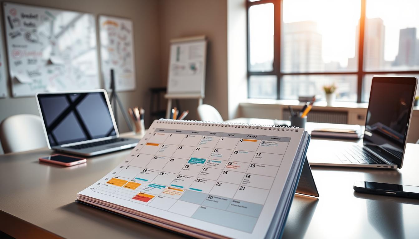
Create colorway variants, size-restock alerts, and “style it three ways” visuals. Map these to a simple media calendar: teaser, launch, and reminder.
Save time: generating options reduces blank-page friction and helps teams ship more posts without losing consistency.
“Magic Design speeds concept-to-content so your team can focus on timing and distribution.”
Generate On-Brand Graphics with Text to Image for Fashion Content
Turn concise prompt ideas into textured graphics that support product photography without stealing focus.
When to use text-to-image: create clean backdrops, subtle texture overlays (linen, paper, concrete), or seasonal scenes when a studio shoot is impractical. This method speeds content creation and stretches your budget.
Prompt ideas for backgrounds, textures, and seasonal themes
- Minimal studio background — soft shadow, neutral tones.
- Soft daylight, neutral tones — warm window light for lifestyle vibes.
- Holiday sparkle bokeh — low-contrast shine behind the hero image.
- Streetwear concrete wall texture — gritty but low-detail backdrop.
How to blend generated images with real product photos
Use the generated image as a background layer and keep the product photo as the hero. Add a soft shadow under the cutout so the composite reads natural.
Avoid busy graphics near text areas. Keep high-contrast patterns away from price or headline space so legibility stays strong.
Quality checks to keep product colors accurate
Compare the on-screen garment color to the original photo. Avoid tint overlays that shift hues. Keep white balance consistent across images and photos.
Approval step: confirm backgrounds do not wash out blacks or alter colorways before publishing.
| Use | Prompt pattern | Best practice | Quality check |
|---|---|---|---|
| Clean backdrop | “minimal studio background, neutral” | Low texture, soft vignette | Match white balance to hero photo |
| Texture overlay | “linen fabric texture, subtle” | Layer at low opacity | No pattern over text areas |
| Seasonal scene | “holiday sparkle bokeh, warm tones” | Keep contrast low behind product | Verify colorway perception |
| Urban mood | “concrete wall texture, muted” | Desaturate to avoid clash | Check shadow for realism |
“Reusing a set of textures per season adds campaign energy while keeping the feed consistent.”
Finally, remember that even the best background needs clean product cutouts. Use your editing tools to polish edges and remove distractions before you finalize content.
Edit Product Photos Like a Pro with Magic Edit and Magic Eraser
Begin with a focused clean-up pass to remove visual noise around the product. Clean hero images boost clarity and click-throughs, and they make downstream layout work faster.
Clean up distractions and polish the hero image
Use Magic Eraser to remove wrinkles, stray tags, dust, or unwanted props while keeping edges crisp. Work in small strokes and zoom to check fine details.
Swap or add elements to fit the campaign concept
Magic Edit lets you add a subtle prop or replace a background item without a new shoot. Keep edits subtle so perspective and shadow remain natural.
Quick color and lighting adjustments for a consistent feed
In the editor align exposure, contrast, saturation, and temperature across photos. Batch the same adjustment recipe for a full collection to save time and keep the grid cohesive.
- Guardrails: avoid changing fit, fabric texture, or true color.
- When to keep imperfections: preserve lifestyle authenticity, but remove anything that reduces product clarity.
- Final step: compare edits to the original image to protect brand trust.
Polished imagery is the base; next, apply readable text and clear CTAs to complete the design.
Add Text, Fonts, and Elements That Improve Readability and Click-Through
Good typography tells shoppers where to look first and what action to take.
- % OFF + category — “30% OFF Denim”
- Limited Drop + date/time — “Limited Drop • Mar 12”
- New Collection + name — “New Collection: Shoreline”
- Restock + sizes — “Restock — Small to XL”
Design text for mobile: high contrast, large size, and one-line headlines when possible. Short lines avoid awkward wrapping.
Use fonts to reinforce brand voice
Choose one display font and one readable body font. A minimalist serif fits premium brands. A bold sans suits streetwear. Keep mixes to two styles max.
Icons, shapes, and highlight graphics
Use price tags, arrows, countdown badges, and stamps to guide the eye. Place CTA near the product or lower-right area for natural thumb reach.
Hierarchy: headline → what/when → CTA. Wording options: “Shop now,” “Tap to save,” “DM to order,” or “Link in bio” depending on goal.
“Simple elements and clear text turn a glance into a click.”
Keep accessibility in mind: avoid thin fonts, give generous spacing, and ensure text contrasts with patterned backgrounds. Once static content is dialed in, apply the same layout logic to motion for Reels-ready creative.
Turn Posts into Videos and Reels-Ready Creative with Canva’s Video Editor
Short videos often reveal fit and fabric in ways still images cannot. Use motion for try-ons, drape tests, and quick styling clips that show how garments move on the body.
When to use video vs. static for product marketing
Use static images for fast announcements: sales, restocks, or single-item highlights.
Choose video for storytelling: lookbooks, outfit transitions, and behind-the-scenes footage that show movement and fit.
Timeline basics: layer, sync, and time each element
Layer clips and overlays so the product stays front and center.
Sync text cards to key visual moments and time transitions to avoid jarring jumps.
Captions, music, and Beat Sync for social-first pacing
Add captions for viewers who watch with sound off and keep on-screen offers visible throughout the clip.
Use Beat Sync to align cuts to music and raise engagement with rhythmic pacing without over-editing.
Mobile optimization tips to reduce lag and editing time
Work with shorter clips and lighter effects to prevent buffering, pixelation, and crashes on the app.
Export watermark-free files and choose mobile-focused settings to preserve quality when sharing to social media.
| Need | Best Practice | Why it matters |
|---|---|---|
| Show fit | Try-on clip, 5–10s | Conveys movement and sizing |
| Storytelling | Sequence multiple looks, 15–30s | Builds context and style ideas |
| Fast announce | Static image or 3–5s clip | Quick to produce and share |
“Optimize files and timeline choices early so editing on mobile is smooth and exports keep crisp detail.”
Export, Share, and Publish Without Losing Quality
Choose export settings that protect clarity and color before you send designs live. A careful export keeps typography sharp and prevents color shifts across screens.
Best file types and settings for social images
Use PNG for text-heavy images to avoid compression blur. Pick high-quality JPG for photos when file size matters. For video, export MP4 H.264 and keep bitrate moderate to limit buffering.
Sharing to your channels and team review
Share a view-only link for team review. Collect comments, confirm pricing and dates, then lock the final file. The platform scheduler (Pro tier) helps plan and saves time when publishing across social media.
Scheduling and consistent multi-channel publishing
Batch exports and schedule ahead to keep a steady cadence. Adapt one creative to each media platform while keeping brand elements the same. For final checks, open the shared design in a new tab window and compare side-by-side with the product page and inventory sheet.
Final step: perform a mobile check. Open the image in a new tab, view in a new tab window on your phone, and confirm legibility, margins, and that no key text sits too close to the edges.
“Export well, share clearly, and schedule consistently to reduce last-minute fixes.”
Troubleshooting and Workflow Tips to Save Time Long-Term
A few simple checks will stop most sync and performance issues before they cost time. Start with quick fixes, then use steady habits so you avoid repeating the same problems.
Fixing sync issues between desktop and iPhone
Confirm account parity: make sure you are logged into the same account on the Mac/desktop and the app. If changes don’t appear, refresh the design list.
Tap the cloud sync indicator on the design thumbnail to force a sync. If that fails, sign out and sign back in, then open the design in a new tab window.
When the editor buffers, crashes, or won’t play video smoothly
Update the app and browser to the latest version first. Close heavy browser tabs and other apps that use CPU or RAM.
Reduce active layers, split long video clips into shorter scenes, and use a lower-resolution preview while you edit to improve responsiveness.
Workarounds for free vs. Pro asset limits
Filter searches to free images and replace premium photos with your uploaded product images when possible.
Build a small library of reusable elements (badges, tags, and price chips) so you rely less on premium templates.
Repurpose one design into multiple sizes
Duplicate the design, then adjust layout for each format. Keep the text hierarchy consistent so the message remains clear when a window opens new or a new tab opens.
Use Magic Resize or manual crops and check each export in a new tab to confirm margins and legibility.
- Keep one browser window for active edits and a second window for references so a tab window switch doesn’t disrupt work.
- Batch-create weekly assets, standardize file names, and maintain a “ready-to-post” folder to save time at the end of the week.
“Plan → generate → refine → export → publish → troubleshoot — repeat this routine to scale without redoing fixes.”
Conclusion
Create a reliable launch rhythm: pick a template, batch variations, and schedule the run. This simple workflow keeps design time low and output consistent across social media channels.
Recap: prepare clean assets, set up your workspace, apply brand standards, use templates and generative tools, then refine and publish. Follow the product-first rule: the garment must read instantly.
Use Magic Design, Text to Image, Magic Edit, and Magic Eraser as part of a weekly routine for drops, restocks, and seasonal promos. Each tool speeds a step: concept, background, cleanup, and polish.
Keep consistency: repeatable layouts and branded elements reduce time and make posts easier for customers to recognize. Prioritize color accuracy and readable text to protect trust.
Next-step checklist: choose one template set, build a three-piece series (teaser / launch / reminder), batch-create variations, and publish on a steady media calendar. Small systems scale better than last-minute edits.