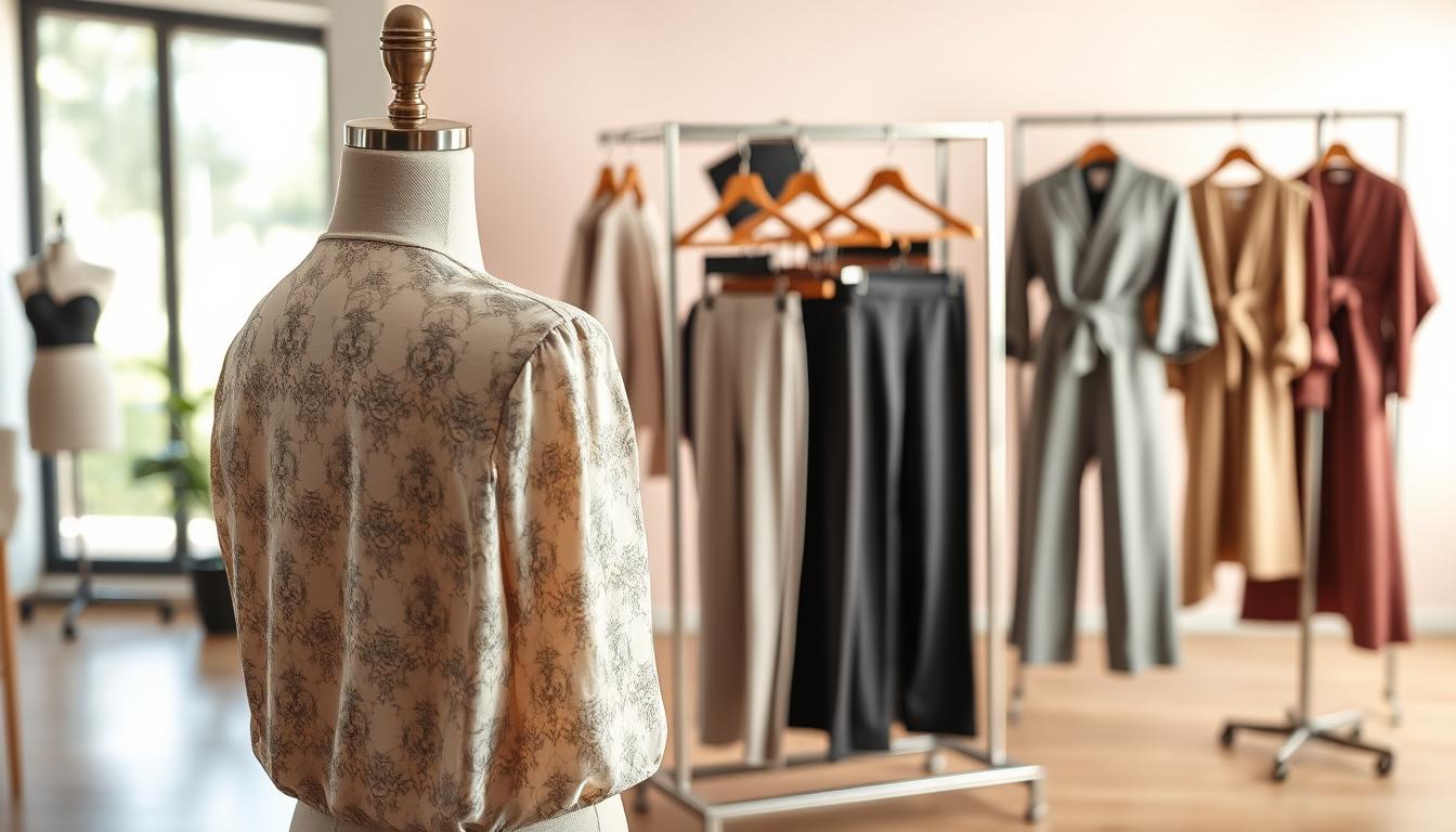
Bad lighting can ruin product images and slow down launches. Color shifts, harsh shadows, blown highlights, and flat exposure all make garments look wrong online.
This guide shows practical steps teams in the United States can use to recover real product look without a costly reshoot. It explains how to prepare inputs, correct exposure and white balance, add natural shadows, and keep edits consistent across channels.
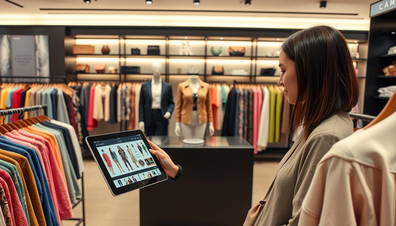
Who this helps: Shopify teams, marketplace sellers, DTC marketers, studio staff, and agencies that manage PDPs, lookbooks, and ads.
Expect faster improvements and lower costs, but maintain quality control to avoid misleading edits and protect brand trust. Later sections cover choosing tools and building a repeatable workflow to scale across SKUs and platforms.
Key Takeaways
- Identify bad lighting by color shift, harsh shadows, blown highlights, and flat exposure.
- Use automated correction when reshoots are impractical to save time and budget.
- Learn steps: prepare inputs, fix exposure/white balance, add natural shadows, ensure consistency.
- Guide is aimed at U.S. e-commerce teams and creative studios.
- Improvements speed workflow, but require review to protect brand trust.
- The article will also help with tool selection and building scalable workflows.
Why Bad Lighting Hurts Fashion Images in E-Commerce and Campaigns
Uneven capture and mixed color casts make even high-quality garments look cheap in catalog imagery. When exposure varies across a set, texture, stitch work, and true tone vanish. Shoppers depend on clear visuals to judge fit and value.
How uneven exposure hides fabric texture, color, and product detail
- Dark items like black denim or knitwear can look muddy; light pieces wash out and lose trim and stitching.
- Hidden detail raises questions about material quality and increases returns and support tickets about “not as pictured.”
Why inconsistent capture breaks brand consistency across platforms
- Mixed looks across PDPs, marketplace listings, and paid campaigns make a collection feel low-effort.
- Brands lose trust when the same product appears different from site to ad to social.
Where poor capture shows up most
- PDP grids need uniform exposure so shoppers compare items fairly.
- Lookbooks rely on series continuity; a single outlier disrupts flow.
- Ads must win attention in seconds—incorrect color or flat texture costs clicks.
| Asset Type | Common Failure | Impact |
|---|---|---|
| PDP Grid | Uneven exposure across SKUs | Lower conversion, more returns |
| Lookbooks | Inconsistent series tone | Reduced perceived quality |
| Ads | Washed color or lost texture | Lower click-through and wasted spend |
Consistent capture saves time downstream. Uniform images mean fewer manual edits, faster approvals, and cleaner testing. A structured fix beats one-off fixes so content stays coherent across platforms and seasons.
Common Lighting Problems in Clothing Photos and What Causes Them
Even small capture problems can change how garments read online and cost sales. Below are the typical faults that affect product images and a short cause-and-effect guide to help you decide the right fix.
Yellow or blue color casts from mixed bulbs
When tungsten, window light, and cool LEDs mix, whites and neutrals shift warm or cool. That distorts brand color and makes fabric tones inconsistent across listings.
Harsh shadows that change fit and silhouette
Strong overhead lamps create deep shadows in folds and under sleeves. Shadows hide seams and can make a silhouette look wider or wrinkled, altering perceived fit.
Blown highlights on satin, leather, and reflective accessories
Glossy materials clip quickly. Saturated highlights eliminate texture and fine detail, leaving leather and metallic hardware looking flat or plastic.
Flat lighting that removes depth
Close ring lights or direct flash wash out form. Flat images lack depth and make garments read like cutouts rather than real products.
- Quick checks: inspect the histogram, watch exposure warnings, and zoom into white areas for color cast.
- Cause guides fix choice: WB for color cast, shadow recovery for harsh shade, highlight control for reflective surfaces, contrast for flat images.
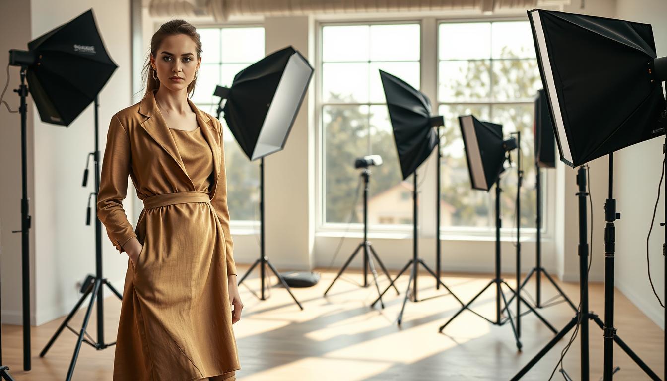
When AI Beats Traditional Photoshoots for Fixing Lighting Fast
For many e-commerce teams, speed and consistency matter more than a full reshoot. Automated editing can generate corrected imagery in minutes, cutting the turnaround for urgent catalog updates.
Where traditional photoshoots require booking a studio, crew, models, and retouching, rapid edits remove much of that overhead. This saves both direct costs and the indirect time tied to logistics and styling.
Real time and cost differences
Compare timelines: scheduling a shoot often takes days or weeks. Styling, capture, and retouching add more days. Automated edits can finish in minutes, so teams meet launch dates without blocking production.
Operational and sustainability gains
Operationally, teams iterate faster on exposure and background consistency without redoing the whole shoot. That speeds campaigns and keeps assets uniform across platforms.
Environmentally, fewer sample shipments, fewer on-site sets, and less travel reduce waste and carbon from production.
When this approach fits — and when it doesn’t
- Best for last-minute catalog fixes, marketplace listing standardization, and high-volume edits.
- Not a full substitute for premium hero campaigns where a complex creative shoot still wins.
- Works especially well when the issue is lighting or exposure rather than product construction or fit.
AI Fashion Photo Lighting: What It Can Fix and What It Can’t
Many catalog problems are recoverable with focused edits that prioritize product truth. Small, controlled adjustments can restore exposure balance and make a set read as a single collection without re-shooting each SKU.
What reliable edits achieve
- Balanced exposure across a set so dark and light variants match on PDPs.
- Smoothing uneven illumination to improve perceived texture and form.
- Making scene lighting feel coherent after background swaps or batch processing.
What needs extra care
- Logos, repeats, and detailed prints — algorithms can warp typography or pattern alignment.
- Seam placement and hems; check for unnatural wrapping or stretched detail.
- Model poses where drape and fit must remain truthful to avoid misleading shoppers.
Keep edits honest
Do not change the actual colorway, alter garment shape, or add elements that do not exist on the product. These practices protect brand trust and lower return rates.
Review workflow: zoom-check chest prints and hems, compare to a color reference, and verify consistency across sizes and variants. Choose tools with strong control features — batch presets and parameter locks reduce random outputs and help maintain brand consistency.

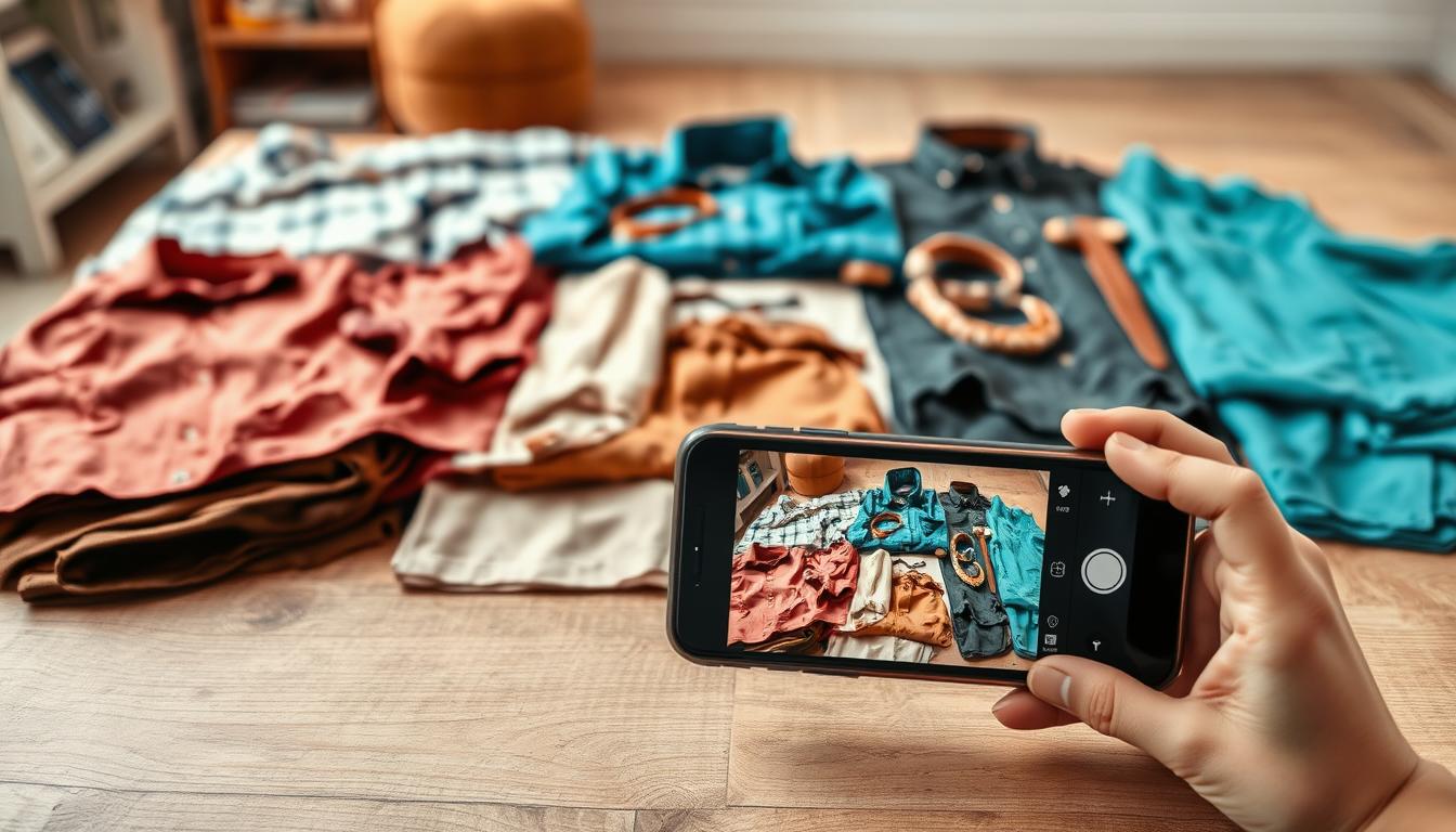
Prep Your Photos for Better AI Lighting Results
Start with consistent inputs and most downstream fixes become predictable.
Choose the right starting image type. Flatlays work best for speed and bulk uploads. Ghost mannequin captures give accurate shape and are ideal for fit-focused PDPs. On-model images show true drape and help marketing creative. Claid and similar platforms can convert flatlay or ghost mannequin files into on-model results when needed.
Capture consistent angles and poses
Keep camera height, focal length, and framing the same across a set. That prevents perspective shifts when batch presets apply.
For on-model work, standardize poses. Small pose changes move shadows and ruin matched outputs. Use a short pose list and repeat it for every colorway.
Set a color reference
Include a gray card or a white swatch in a few frames per SKU. A reference keeps fabric color true when you rebalance exposure or correct casts.
Organize by variant and use cases
Group images by SKU, colorway, fabric, and platform target (PDP vs campaign). That means presets apply predictably and reduce manual fixes.
| Input Type | Best For | Effect on Batch Edits |
|---|---|---|
| Flatlay | Fast cataloging, multi-SKU shoots | Easy color and exposure matching; limited drape realism |
| Ghost mannequin | Shape accuracy for listings | Good for consistent silhouette; fewer masking artifacts |
| On-model | Marketing and realistic drape | Needs pose control; shadow placement matters for uniform edits |
Outcome: Better prep gives fewer artifacts, faster approvals, and consistent product presentation across channels.
Step-by-Step: Fix Exposure and Contrast Without Losing Fabric Detail
Correct exposure first. This keeps woven texture and stitch detail from being lost when you adjust contrast or recover shadows. Work in small steps and check results at full size.
Recover shadows while keeping knitwear and dark colorways clean
Lift local shadows with targeted curves or masks rather than global sliders. Use low-opacity brushes and preserve midtone separation so folds in knits remain distinct.
Tame highlights on glossy fabrics so texture stays realistic
Reduce clipped highlights with highlight recovery and localized desaturation. Keep tiny specular highlights to signal real surface sheen instead of flattening the material.
Use AI upscaling to preserve detail after lighting adjustments
After major exposure or contrast work, upscale the file with Claid’s retouching and upscaling tools to avoid softness. Then check cuffs, collars, and seams—edges reveal quality and blur easily.
- Order: exposure → contrast → local shadow/highlight recovery.
- Verify at 100% on a neutral background to spot color shifts and compression artifacts.
Step-by-Step: Correct White Balance and Color So Products Look True-to-Life
First, lock a neutral baseline; that single step keeps brand hues stable across channels. Neutral whites make later fixes predictable and reduce surprises on marketplace and Shopify pages.
Remove warm indoor casts and cool window shifts
Neutralize the global white balance first. Use a gray or white swatch in the frame and set global WB to that target.
Then check key brand colors — logos and signature hues — so they stay true after the global pass.
Keep prints and brand colors consistent across a full collection
Spot-check repeating patterns and text at 100% zoom. Even small WB shifts can turn navy to black or push reds toward orange.
Create a seasonal “color truth” set of hero SKUs and compare every edit to those references before export.
Spot-check skin tones on models when rebalancing
After color work, verify skin tones for all models used in the set. Mixed-light originals often need local selective tweaks to keep tones realistic.
- Neutralize cast (global WB).
- Verify brand colors (logos, signature hues).
- Refine selective areas (skin, whites, metallics).
Consistent master edits cut cross-platform surprises and deliver repeatable results for product images across platforms.
Step-by-Step: Create Natural Shadows and Studio-Grade Depth
Natural shadows restore depth so garments read as real objects, not cutouts on a white field. That visible grounding raises perceived quality and reduces returns caused by an unnatural “floating” look.
Add realistic grounding shadows so products don’t “float”
Soft contact shadows are the base for catalog images. They anchor hems and hems’ edges so the product reads as placed on a surface.
For lifestyle scenes, use slightly longer directional shadows for context. Keep falloff subtle so the background and subject match.
Match shadow direction to the scene for believable imagery
Decide on a primary light vector and align all shadow angles to it. If the implied sun comes from the left, shadows must fall right and lengthen with distance.
Toggling shadows on and off helps spot mismatches quickly. If a shadow breaks the light logic, the composite looks like a cutout.
Keep drape and folds credible when enhancing lighting effects
Respect fabric behavior: shadows should follow folds, sleeve volume, and seams. Never paint a flat shadow across a gathered cuff.
Zoom edges around collars and cuffs to check for spill. Correct masks where shadow bleeds into transparent or reflective areas.
“Consistent depth cues across a catalog make every SKU feel studio-produced and trustworthy.”
| Use Case | Shadow Type | Key Check |
|---|---|---|
| Catalog | Soft contact shadow | Anchor hems; no spill into transparent areas |
| Lifestyle | Longer directional shadow | Match sun angle; subtle falloff to background |
| On-model | Layered local shadows | Follow drape and body contours; preserve detail |
- Iterative checks: toggle, zoom, and compare to a hero reference.
- Use shadow presets per fabric type to keep imagery consistent across the catalog.
Step-by-Step: Replace or Enhance Backgrounds While Keeping Lighting Consistent
Standardizing the backdrop is a high-impact step that speeds publication and reduces post-production work. Use background tools like Photoroom to automate routine edits and Claid for scene generation when you need campaign variety.
Use background tools to standardize catalog imagery for marketplaces
Background replacement is fastest when originals have cluttered sets, inconsistent walls, or mixed tones. Removing a noisy backdrop avoids re-shoots and helps listings match across platforms.
Create lifestyle scenes for campaigns without re-shooting
Generate street, interior, or studio scenes so content teams get variety. Keep the garment’s shadow direction and color temperature matched to the new scene to avoid visual conflict.
Maintain consistent edits across photos to streamline production workflows
Catalog standardization workflow:
- Remove background and clean edges.
- Apply white, neutral, or brand gradient.
- Restore contact shadows and check edges for realism.
- Batch-apply presets and spot-check hero SKUs.
QC tips: Ensure marketplace-safe backgrounds, avoid props that imply bundled goods, and verify the product remains the focal point. Consistent backgrounds cut manual production time and speed publishing across platforms.
| Use Case | Best Background | Key Check |
|---|---|---|
| Marketplace catalog | Clean white or neutral gradient | Uniform tone; true-to-product color |
| Campaign content | Styled lifestyle scene | Match shadow direction; preserve drape |
| Bulk SKUs | Brand gradient preset | Batch consistency; edge and shadow QA |
Choosing Tools Like Claid, SellerPic, Botika, BetterStudio, Ayna, FASHN AI, Mocky AI, and Photoroom
Decide what matters most—catalog fidelity, fast on-model results, or social velocity—then pick tools to match. Start by matching output needs to platform strengths before comparing price or credits.
Best fits for catalog workflows
Claid offers a full e‑commerce suite: model generation, backgrounds, retouching, upscaling, video, and an API. It is credit-based (50 free credits; plans start at $9/month) and suits structured pipelines that need batch control and high repeatability.
Best fits for Shopify brands
Ayna, Botika, and BetterStudio integrate directly with stores. Ayna gives many preset models and aspect ratios with a Shopify app (50 free credits; plans from $13/month). Botika focuses on on‑model generation and video (trial credits; plans from $22/month). BetterStudio is premium, studio-grade, and scales with bulk generation and API support (per image pricing and subscriptions).
Best fits for social content
SellerPic and Mocky AI favor short video, UGC-style reels, and fast scene swaps. SellerPic has a free tier (~20 credits) and plans from $29/month. Mocky AI offers a broad creative suite and credit-based pricing that supports quick reels and story formats.
Best fits for virtual try-on
FASHN AI focuses on precise product-to‑model alignment and API access. Use it when fit, drape, and garment fidelity directly affect conversions and returns.
When to use background editing tools
Photoroom is ideal when strict background consistency and fast publishing are priorities. Pair it with a model generator to keep shadows and color matched across large SKU sets.
Practical test: run 3–5 SKUs (include glossy and printed items) through each platform and score realism, color accuracy, and repeatability.
| Need | Top Tools | Why |
|---|---|---|
| Catalog consistency | Claid, BetterStudio | Batch control, retouching, upscaling; API for pipelines |
| Shopify integration | Ayna, Botika, BetterStudio | In‑platform apps, preset ratios, quick product attachment |
| Social and UGC | SellerPic, Mocky AI | Short video, scene templates, fast creative outputs |
| Virtual try‑on | FASHN AI | Product-to-model alignment; API for fit fidelity |
| Background standardization | Photoroom | Automated background edits to maintain uniform catalogs |
- Start small: test with hero SKUs across tools.
- Score consistently: realism, color, repeatability, and throughput.
- Choose for workflow fit: credit model, API needs, and store integration matter most.
Build a Repeatable Workflow for Consistency Across Products, Poses, and Platforms
Build a predictable pipeline so every SKU follows the same exposure, color, and crop rules. Start with standardized inputs and move through preset-based edits, exports, and a compact QC loop. This keeps collections consistent across web, marketplaces, and campaigns.
Create lighting presets by category, fabric type, and brand style
Define presets for tops, outerwear, and accessories and tune them for knit, denim, and satin. Save brand styles—bright studio or moody editorial—so every team member applies the same look.
Export for each channel with correct aspect ratios and framing
Map export targets: Shopify PDP crops, marketplace squares, paid social verticals, and homepage hero ratios. Use Ayna for preset aspect outputs and verify framing so product proportions never drift.
Scale with bulk edits, credits-based planning, and API workflows
Plan credit budgets before seasonal drops. Use bulk generation in BetterStudio for large batches. For high-SKU catalogs, integrate Claid or Mocky AI APIs to automate conversions and reduce manual steps.
Quality control checklist for realism, color accuracy, and conversion-ready results
- Color check: compare to a reference swatch at 100%.
- Prints and logos: inspect seams and repeats for distortion.
- Shadow logic: confirm direction and softness match the scene.
- Fit honesty: ensure no altered drape that misleads shoppers.
Document every decision—preset names, target brightness, and approved backgrounds—so teams reproduce the same outcomes without rework.
“Consistent, studio-grade presentation reduces uncertainty and improves conversion.”
Conclusion
,
Start with a clear concept. Define the look you want, pick tools that match catalog or campaign needs, and create presets for fabrics and poses.
Standardize exposure, white balance, shadows, and backgrounds so your product images stay consistent across platforms. Use neural fashion workflows for fast, high-resolution exports while keeping edits truthful to what ships to customers.
Begin small: test a handful of SKUs, document presets, and measure speed and consistency against manual edits.
Build a simple QC checklist, scale with batch processing or APIs, and keep iterations tight. The present era of fashion photography lets brands deliver more creative variety and faster turnaround without sacrificing trust.