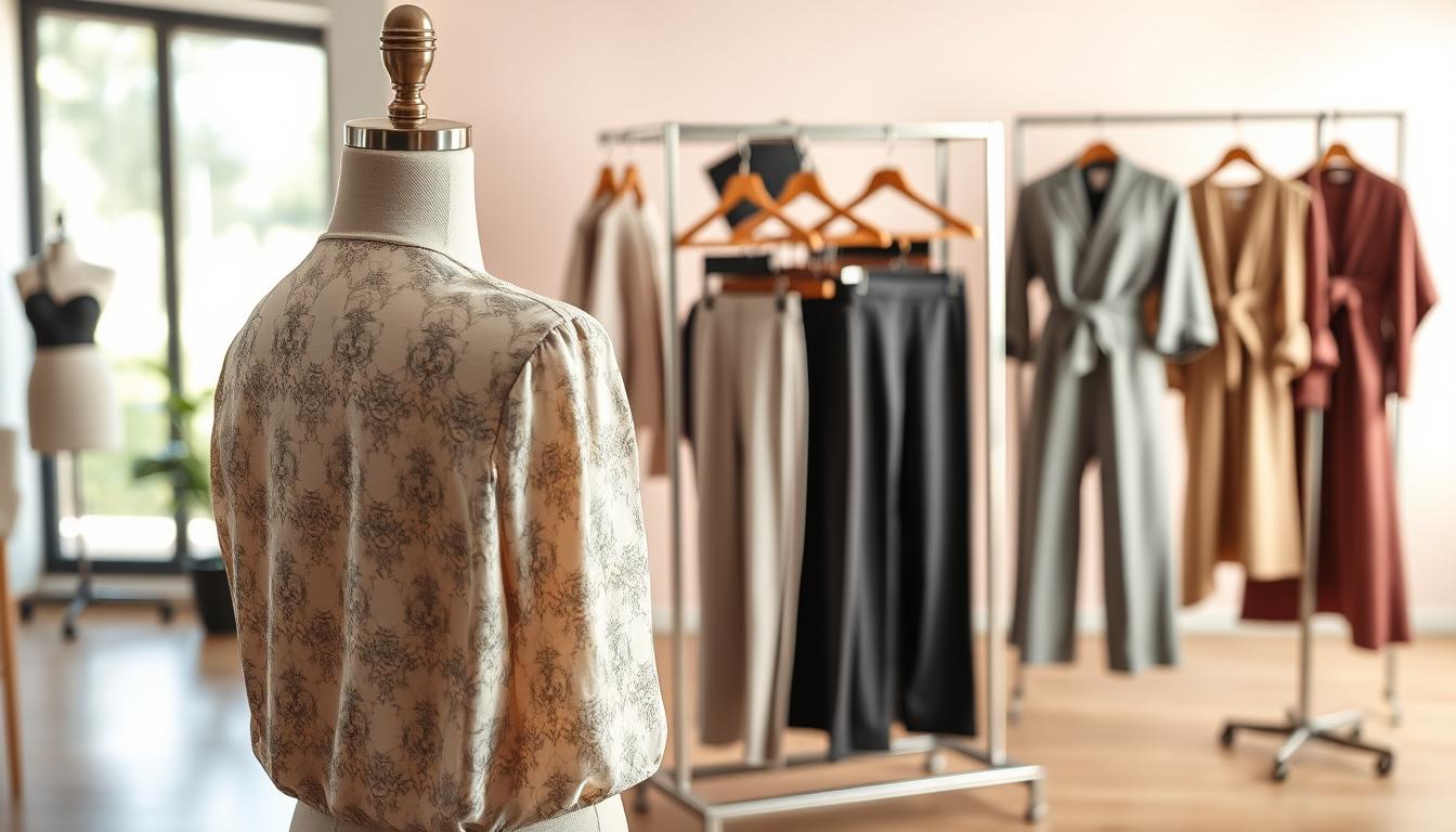

In online retail, the same garment can look like a different shade across a product page. Lighting, camera settings, and background influence how a photo reads, and that mismatch harms trust and sales.
AI color correction clothes offers a practical, time-saving way to balance exposure, contrast, and tones so images appear natural and consistent without complex software.
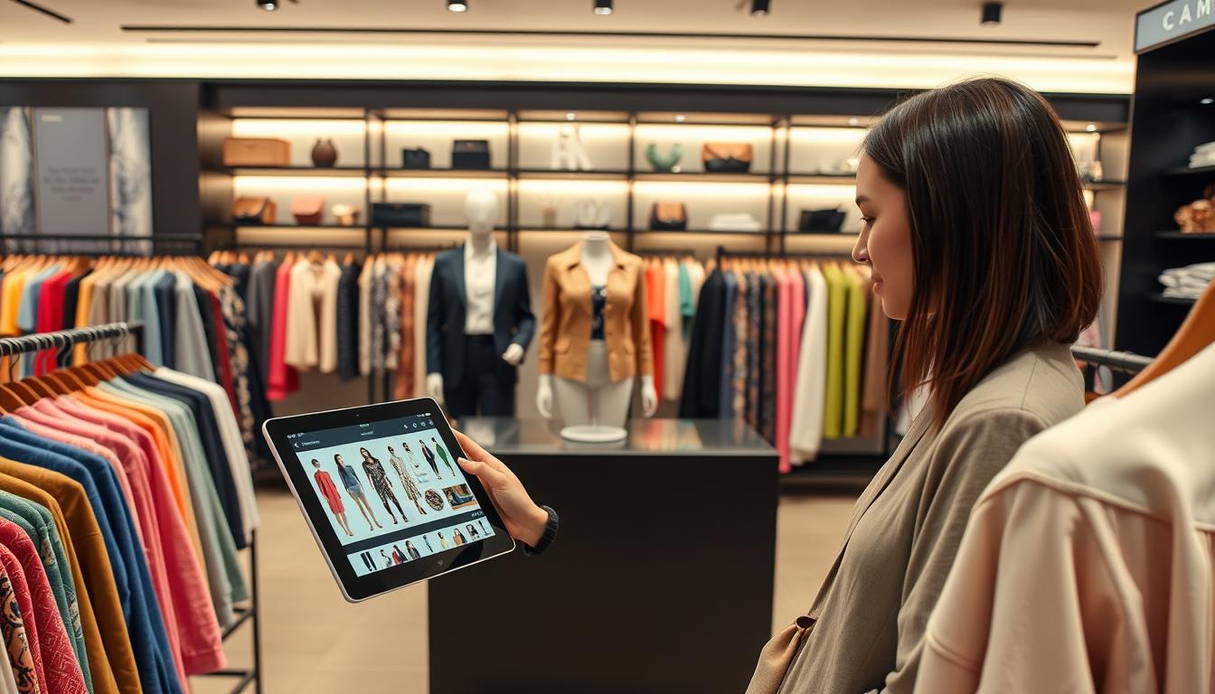
The process runs in the browser for many tools, so a team can upload an image, let the tool auto-adjust in seconds, compare before and after, then download for listings or social posts.
This guide is for online sellers, fashion brands, marketplaces, photographers, and social media managers who need accurate color and a consistent look across product photos.
Note: when true recolors or new variants are required, you’ll switch from correction workflows to recolor workflows later in the article.
Key Takeaways
- Inconsistent photos often come from lighting and camera differences.
- Auto tools can balance exposure, contrast, and tones quickly in a browser.
- This method saves time and needs little editing skill.
- Use the workflow: upload, auto-fix, compare, download for product use.
- For new colorways, move from correction to recolor workflows later.
Why Clothing Photos Show Color Differences in the First Place
Small technical changes during a shoot can make the same garment look different in product photos.
Lighting and exposure shifts
Underexposed shots deepen shadows and mute clothing colors. Overexposed images wash out fabric detail and distort tones.
Mixed daylight and indoor bulbs make it worse, producing uneven results across a batch of photos.
White balance and temperature
Inconsistent white balance between sessions or angles changes the temperature. Whites can lean yellow or blue and a shirt may read incorrectly on screen.
Backgrounds and nearby surfaces
Bright walls or warm wood reflect onto garments and create unwanted casts. Simple backgrounds reduce that risk and keep clothing colors true.
Camera processing and settings
Auto HDR, picture profiles, and phone enhancements alter photo color even when shots are minutes apart. That mismatch undermines customer trust.
| Cause | Effect on Image | Impact on Product Photos |
|---|---|---|
| Under/Over exposure | Loss of detail, shifted tones | Mismatched catalog shades |
| White balance shifts | Warm or cool temperature | Inaccurate clothing colors |
| Background reflections | Color casts on fabric | Confused buyer expectations |
| In-camera processing | Variable edits applied | Inconsistent product images |
Standardizing these variables is the first step to consistent listings. The next section explains how automated tools neutralize those issues and unify a catalog’s photo color quickly.
What AI Auto Color Correction Actually Changes in Your Image
Auto correction makes a few targeted edits that matter most for product photos. Media.io Auto Color Correct adjusts temperature, contrast, white balance, saturation, and exposure to make an image look natural and unfiltered.
Core adjustments and what they do
- Temperature: warms or cools a photo so fabrics stop leaning too blue or too warm.
- White balance: restores neutral whites so surrounding light no longer skews garment tones.
- Saturation: raises or lowers intensity so colors appear true, not oversaturated or muddy.
- Contrast: improves separation between highlights and shadows so texture reads clearly.
- Exposure: brightens or darkens an image to recover lost detail and correct washed-out tones.

Natural and unfiltered means showing the product as a shopper would see it under balanced light: accurate representation, consistent catalog pages, and fewer surprises at checkout.
When to use correction vs. a stylized look: use natural correction for product listings where accuracy matters. Choose grading or stylized edits only for lifestyle shots that need a mood. Grading can mislead buyers on product pages.
“If the item is the right color but looks wrong, use correction; if it is the wrong color for the listing, use recolor or reshoot.”
Expect subtle fixes on well-shot images and bigger improvements when exposure or white balance are off. These tools boost perceived quality but do not change fabric hue to a new shade—that’s recoloring, covered later.
How to Use an AI Auto Color Correction Tool for Faster, Consistent Results
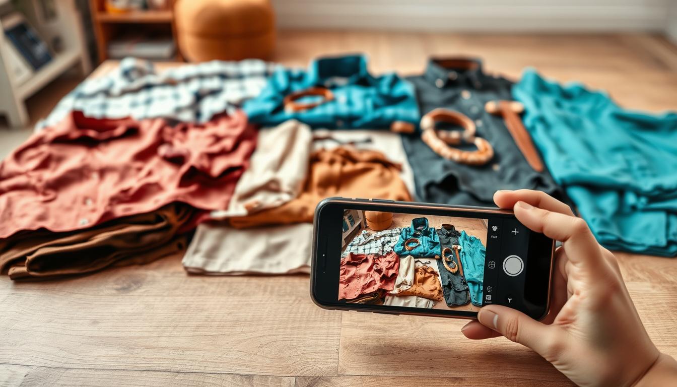
Start by launching an online free tool in your browser and dropping an image to begin instant processing. The browser-first workflow keeps teams moving without installs or plugins.
Quick upload and automatic processing
Click the upload image button or drag-and-drop a file. The app analyzes the image and runs edits in seconds. Processing time scales with file size and resolution.
Preview and compare before you download
Use the Compare view to check whites, neutrals, and garment tones against other listing images. Zoom in to verify fabric texture and ensure highlights or shadows remain natural.
Supported files, limits, and a common edge case
Supported images include JPG, JPEG, PNG, WebP, and BMP. For motion, MP4 and MOV work too.
Keep images under 25MB and 6000×4000 px. Video uploads should be under 50MB. If a transparent background turns black after processing, edit a non-transparent version for best results.
Download and QA
Download watermark-free results for product pages and social media. Run quick QA: check neutral grays, inspect texture, and compare final results with the original batch to confirm consistency.
AI color correction clothes for Accurate Product Photography
Consistent visual tone across a catalog builds trust and reduces returns. Use automated correction to standardize exposure, white balance, and saturation so a garment looks the same across model, flat, and detail shots.
Matching clothing colors across a full catalog for a consistent brand look
When listings share a unified look, customers trust that the item they buy will match what arrives. Simple automatic edits make catalog pages cohesive and protect brand reputation.
Fixing underexposed, overexposed, dull, or low-saturation photos
Common fixable problems include dark shadows, washed highlights, and muted tones. The tool adjusts brightness and saturation to restore balanced tones so clothing colors read more accurately.
Improving perceived image quality without reshoots or complex software
Correction reduces the need to reshoot missed angles. Teams without dedicated retouchers can get product-ready results fast, avoiding heavy desktop software and long workflows.
- Checklist for review: compare front, back, and detail shots; confirm neutral grays; watch for saturation spikes in reds and blues.
- Keep listing edits separate from creative grading to preserve an accurate product style for shopping pages.
- Escalate to recoloring when the garment itself is the wrong shade or a different dye lot is present.
When You Need Recoloring Instead of Correction
Recoloring is for deliberate color changes, not lighting fixes. Use correction when you want to restore accurate tones. Use recolor when you need a new colorway, a mockup, or a creative variant.
Using text prompts to change a specific item
Text-driven workflows let you write simple commands like “change the t-shirt color to navy blue” and apply the edit without manual masking. A modern recolor tool detects objects and swaps hues based on your prompt.
Preserving texture, highlights, and shadows
Top recolor generators keep fabric texture and light intact so the new color looks realistic. This avoids flat fills and keeps usable images for merchandise and ads.
Previewing and exporting HD results
Preview edits before download. Online free editors like Pixelbin accept JPG/JPEG/PNG/WebP (max 10MB) and export HD files without blur or distortion.
Common merchandising use cases
- Create new colorways for design testing.
- Update a catalog when a sample isn’t ready.
- Quickly produce variants such as “change the dress to deep emerald.”
“Recoloring speeds creative testing, but verify new shades match what you sell.”
Best Practices to Get Reliable, Realistic Color Changes Every Time
Small setup choices deliver predictable, repeatable results. Before editing, assemble sharp, well-lit photos so the tool can detect edges and garments cleanly.
Start with the highest-quality photo
Use files with good exposure, minimal noise, and proper focus. High-quality inputs reduce false detections and speed up editing time.
Keep backgrounds simple
Neutral, uncluttered backdrops cut down color bleed and unwanted shifts. Simple scenes make both correction and recolor edits more realistic for skin and clothing.
Write clear prompts and validate on screens
Use precise color names like “navy,” “charcoal,” or “warm beige” and name the clothing item. Then check results on phone and desktop to catch display differences before publishing.
- Batch edits: Group similar lighting sets to save time and keep a uniform catalog style.
- Versioning: Save names such as original, corrected, recolor and log applied edits.
- Realism checkpoint: Watch for over-saturation in reds and crushed blacks and confirm fabric texture stays natural.
Conclusion
A fast one-click pass can normalize exposure, white balance, and tone so your catalog looks consistent and trustworthy.
Use AI color correction clothes when accuracy matters and you need natural presentation. Choose recolor when you want intentional changes or new variants.
Make a simple habit: run an auto pass, compare before and after, and apply the same review checklist to every image or photo set. The same steps work for video clips, where tools can fix balance and contrast in seconds and keep your brand consistent across media.
Practical next steps: pick a tool that supports your file types, test on a small batch, then scale. Verify results on multiple screens and save a hero image per product to lock long-term consistency.